PaRLY 2
Scope of work
Branding
Interior design
Location
Paris, France
Sixties Chic
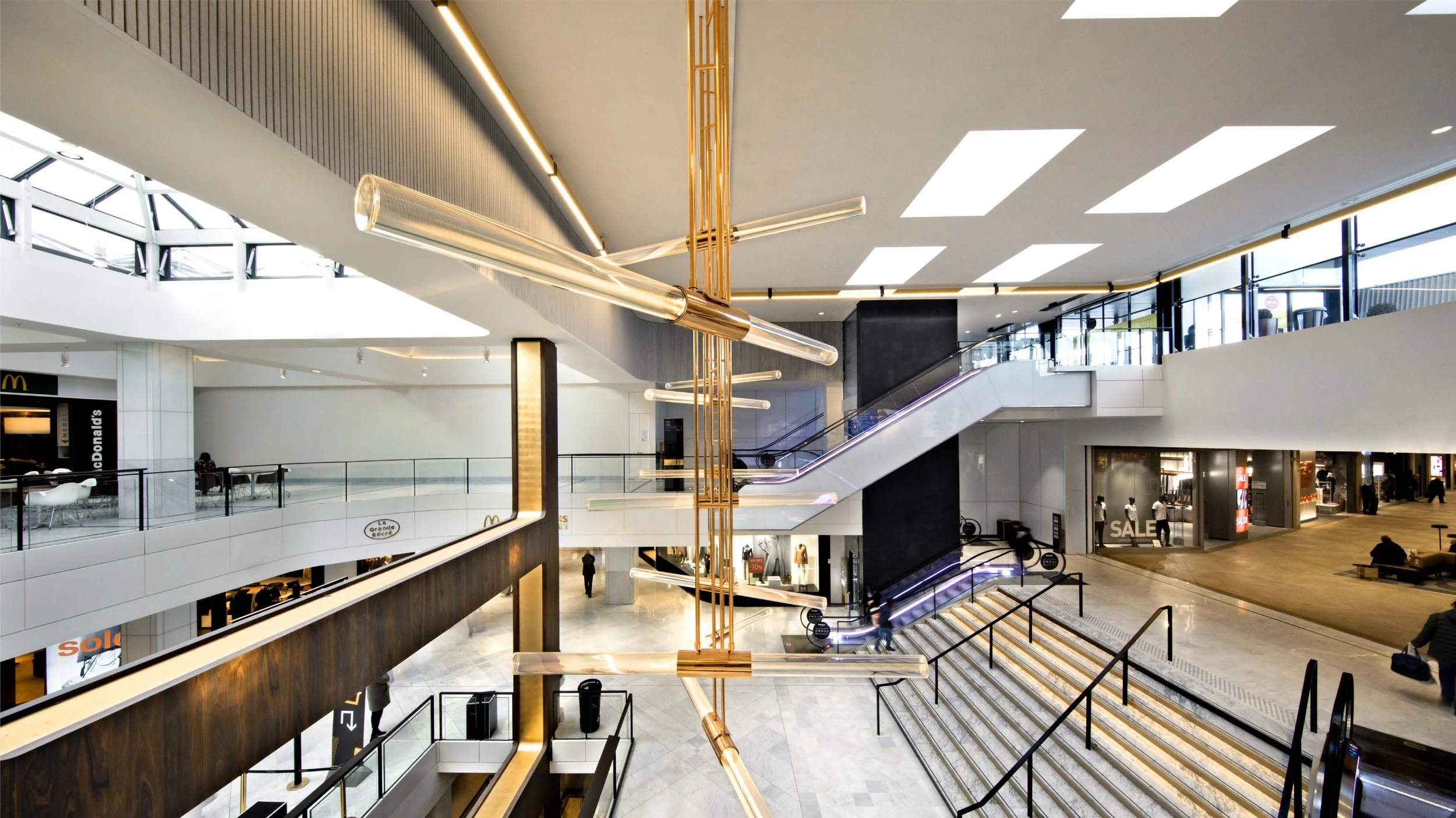
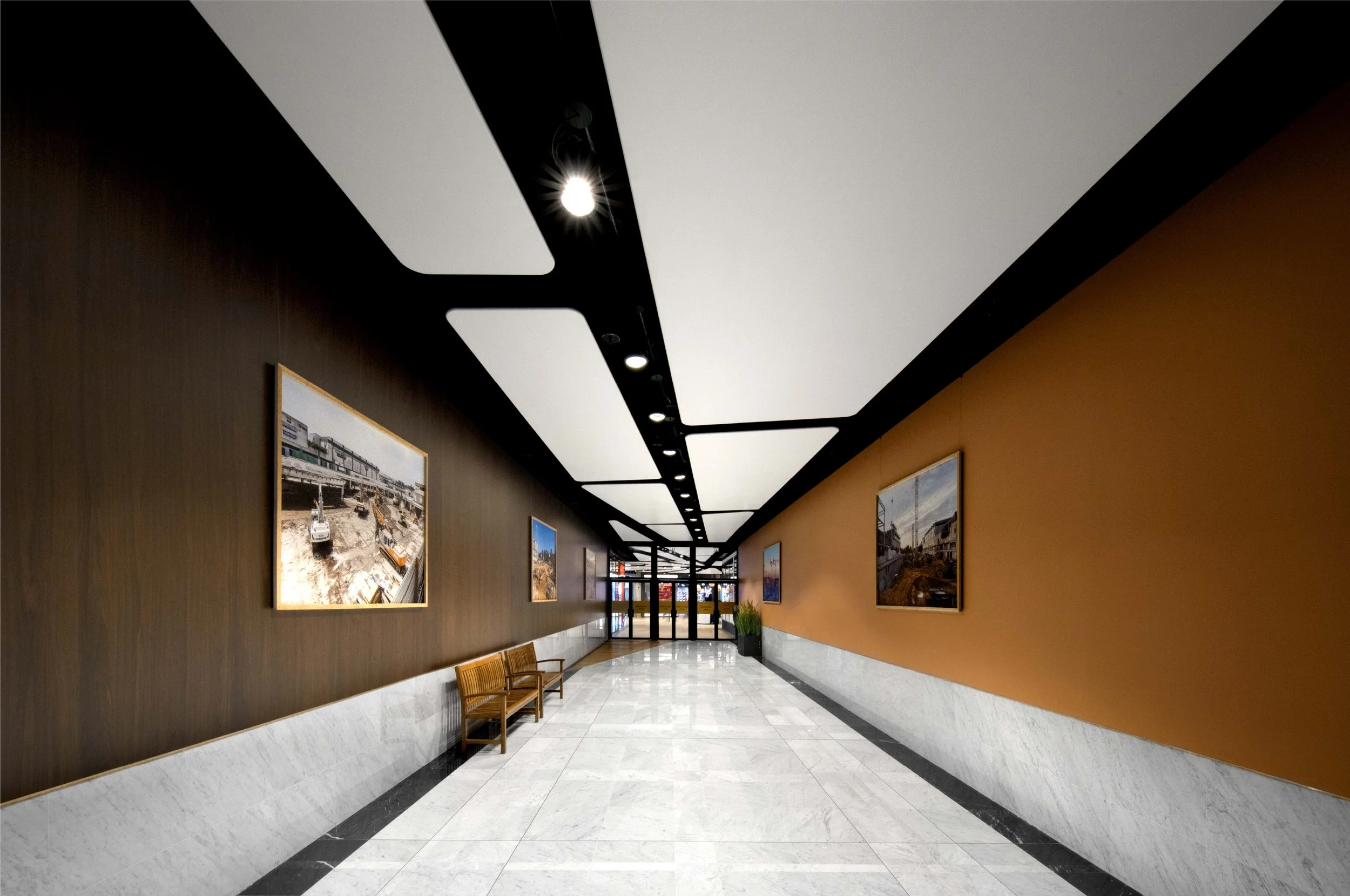
The first French shopping center, opened in 1969 and inspired by the American way of life of the sixties, Parly 2 is reconnecting with the elegance of its design, the nobility of its materials, and the quality of its lighting, volumes, and graphics. For perfect harmony between Parly 2’s architecture and visual identity, the agency has designed a bespoke typeface inspired by the playful and indulgent pop graphics of the sixties. Rounded and charming, with bold yet delicate strokes, the letter "P" curls while the "Y" stretches. The pattern of the initial reinterprets the optical illusions of kinetic art—in gold, of course!
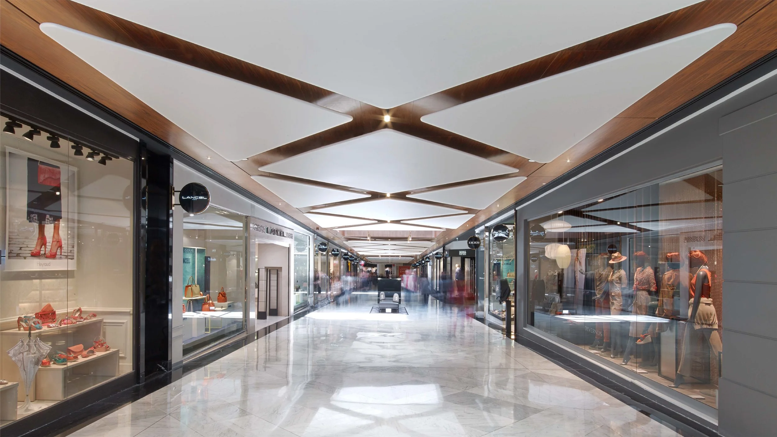
Volumes regain their height, and rest areas feature iconic designers like Eames, Saarinen, Jacobsen, and Prouvé. A vast nave with a golden copper-leaf grid, inspired by Sixties Chic, nods to Paco Rabanne’s metal mesh designs. Visual artists Mathias and Matteo Messervy shape light as a material, creating a dialogue with space and natural illumination.
Photographer © Éric Laignel